Trustees of the Huron-Superior Catholic District School Board approved both a new look for the board and a new vision for the next five years.
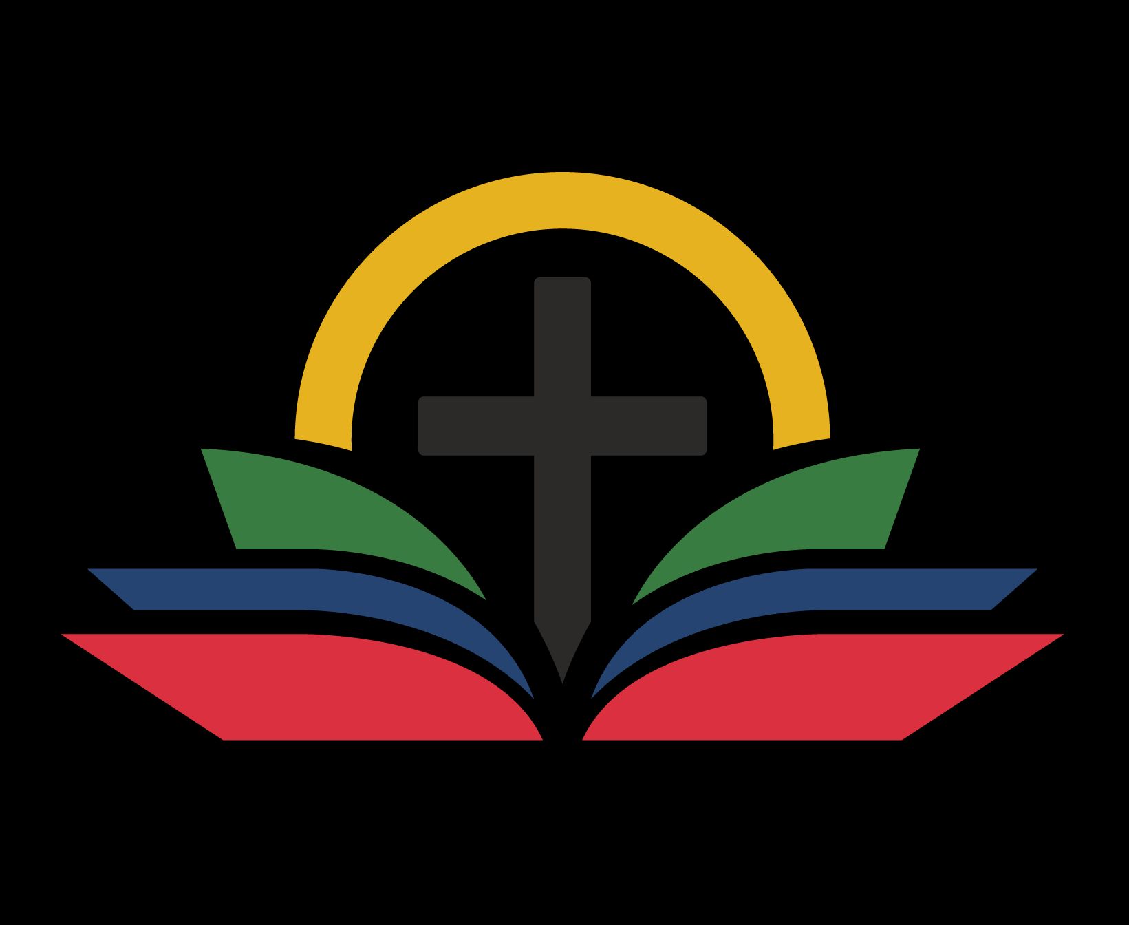
Board chair Sandra Turco says trustees were shown the board’s new multi-coloUr logo designed by Cavera Incorporated, a digital marketing agency based in Sault Ste. Marie.
She says the new logo makes use of six colours blue in the icon and main text of the board’s name in honour of the board’s history and the waters of Lakes Huron and Superior.
She adds the use of white, black, yellow, and red — the colours of the medicine wheel — intentionally honours the important place that Indigenous people have with the board, and the splash of green in the logo represents the board’s focus on practices and decisions that build a sustainable future.
Turco says the components of the new logo align with the board’s new strategic directions with the cross as an obvious reference to the Catholic faith and the relationship of the public and their employees.
The official unveiling took place on Wednesday.


